
01Logo
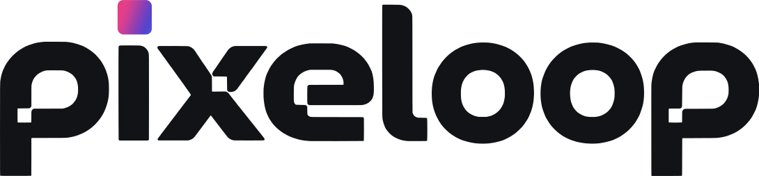
The Pixeloop logo is our name in rounded, chunky letters. The dot on the i is a small square in the Pixeloop gradient. It is the one bit of colour in the logo, so keep it.
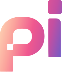
The icon is the first two letters, pi. Use it where the full name will not fit, like a profile picture or a small button. The app icon fills the letters with the full gradient.

Give it room
Keep clear space around the logo, at least half its height on every side. Nothing should crowd it.
Black on light, white on dark
Use the file made for the background. The gradient dot on the i stays in both. Never recolour the letters.
Keep it whole
No stretching, tilting, shadows or outlines. On screens, keep the logo at least 20px tall.
02Colour
Pixeloop is mostly white and ink, so the work on screen is always the most colourful thing. Cobalt marks what you can press. Pink and indigo mark AI. Click a colour to copy it.
Neutrals
Cool greys for pages, lines and text, from lightest to darkest.
Status
Only for what they mean. Never as decoration.
The balance
A rough guide to how much of each a screen should hold.
03Gradient
The gradient is the most recognisable thing we own. Warm cream turns into spark pink and then cool indigo, like light moving across a page. Because it is loud, we use it like a highlighter, not a background.
The Pixeloop gradient
Cream to pink to indigo. For big moments: the app icon, a hero panel, a launch. One per screen at most.
The button gradient
Pink to indigo, with no cream, so white text stays easy to read. For small AI buttons, pills and one word in a headline.
The soft wash
A quiet pink to lilac tint behind AI cards. It turns deep plum in dark mode, so it always sits inside the theme.
In a headline, the gradient goes on the one word that carries the idea, and nowhere else on the screen.
Create without limits.
04Light and dark
Pixeloop has a light and a dark theme. They share one set of colour names and only swap the values, so a design never has to be made twice. Light is the default.
Light
A poster for Friday
Same tokens, new values. Nothing else changes.
Dark
A poster for Friday
Same tokens, new values. Nothing else changes.
Cobalt and the gradients stay the same in both. On dark, links lift to a brighter blue so they stay easy to read, and the soft pink tint turns deep plum.
| Used for | Light | Dark |
|---|---|---|
| Page | #F7F8F9 | #0B0D11 |
| Cards and panels | #FFFFFF | #14171C |
| Text | #0E1116 | #F1F2F4 |
| Soft text | #565A63 | #A2A8B2 |
| Lines | #E2E3E6 | #2A2F38 |
| Links and icons | #0A63FF | #5B9BFF |
| Soft AI tint | #FDEFF5 | #2A1A24 |
05Type
Three fonts do almost all the work, each with one job. A fourth, Caveat, adds a handwritten word on our landing pages.
Sizes
Headings run tight and in sentence case. Never Title Case, never all caps, except small labels.
06Shape and space
Pixeloop is flat. A card is the same colour as the page, marked out by a thin 1px line instead of a shadow. Corners are soft, and they get rounder as things get bigger.
Spacing
Every gap is a step on a 4px grid.
Hover
When you point at a card, only its outline changes. No lifting, no glow, no shadow. It keeps the page calm.
07Icons and products
Our icons are Material Symbols Rounded: soft, outlined and drawn in the text colour. The sparkle means AI, and it is the only icon that wears pink.
The product family
Each AI tool has its own mark and its own colour. The colour lives only on the icon, so the tools stand apart and the rest of the screen stays calm.
08How we sound
Talk like a person
Short sentences and everyday words. If a friend would not say it out loud, rewrite it.
Make a claim, not a label
A headline says what we believe, with a little turn of phrase. Never a plain category like "AI image tool".
Name what people get
Talk about the poster, the post, the result. Not the model, the pipeline or how it works inside.
| Say | Not |
|---|---|
| Pixelsmith, the AI designed to design. | AI Image Generation |
| Every prompt is a possibility waiting to be designed. | Make posters, ads, thumbnails and banners. |
| Lift the subject off its background. | Run segmentation on the image. |
The name
Pixeloop is one word with a capital P. Pixel and loop share the same L, so there is only one. Not PixeLoop, Pixel Loop or Pixelloop. The tools follow the same rule: Pixelsmith, Motionsmith, Thumbsmith.
Lines we use
- Your AI designer.
- Create without limits.
- Pixelsmith, the AI designed to design.
- Made for the creator in you.
We never use the long dash in anything people read. If a sentence needs one, it needs rewriting.
09Using the brand
You are welcome to use the logo to link to Pixeloop, or when you write or make a video about us. Please do not change it, and do not use it in a way that suggests we made or support something we did not.
Need a file you cannot find here, like a PNG or a print version? Write to hello@pixeloop.app and we will send it over.